Maybe a better question is: “how should you get your colors?” But more on that later. First, I have to explain my thought process when it comes to color, as it underscores my entire approach. If you just want to jump into the specific things that I do, just watch this video: 7 Tips for Editing Color Photos.
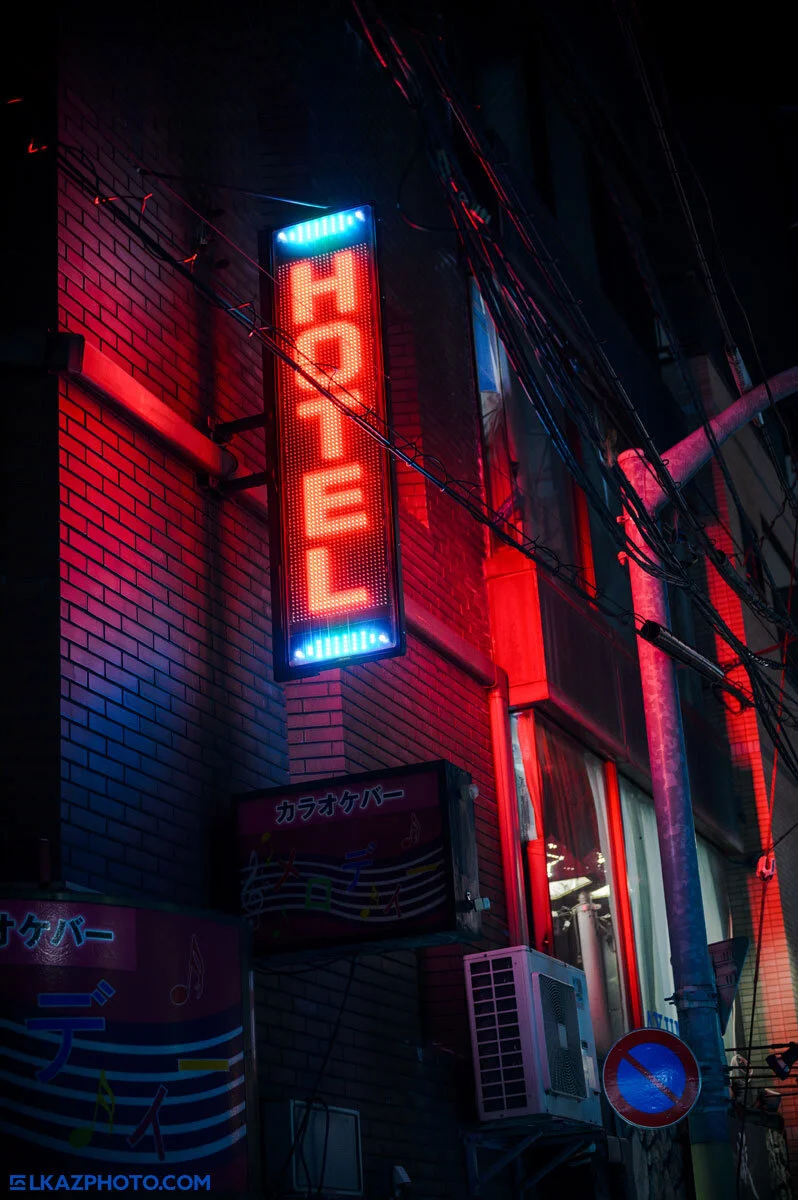
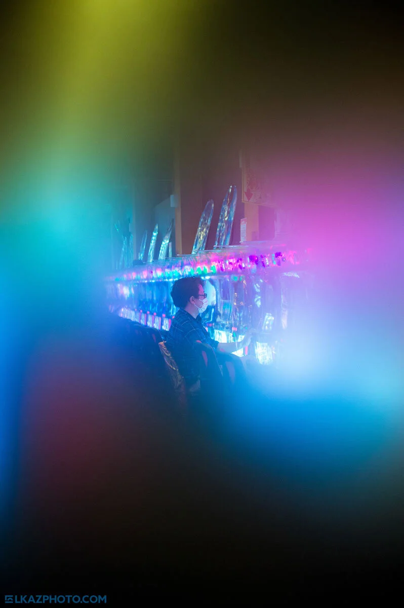
Edited in Adobe Camera Raw.
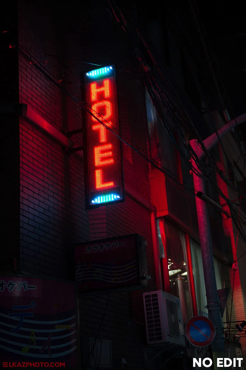
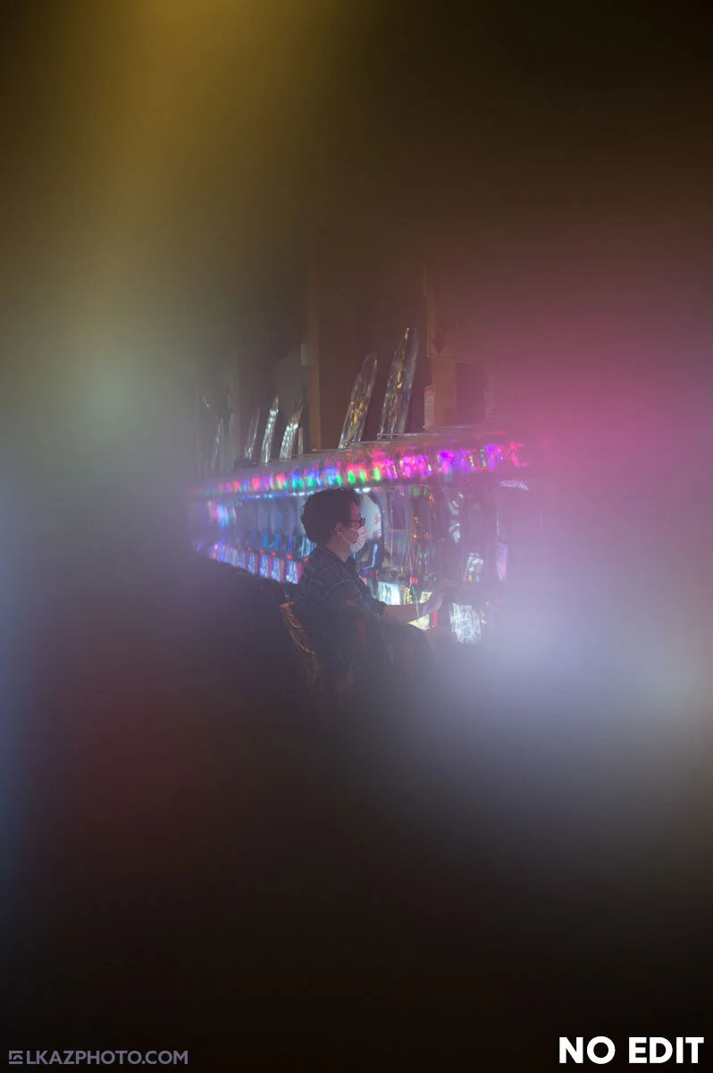
Straight from the camera (Nikon D4)
How I Started - Color vs. Monochrome
When I was just getting into photography I was overwhelmed with the creative options. One of those, was the seemingly simple choice of color or monochrome. I quickly came to realize that actually this was a very complex choice, one that has a profound effect not only on the photo itself but also on how I shoot, and how I see the world. I found that having to constantly make this decision for each shot was a burden. It led to indecisiveness and creative confusion. I also found that I was sometimes using black and white as a crutch. If the photo doesn’t work in color, just ditch the colors! After some months of this I began to see the folly of my ways. I realized that I have to go out and shoot with either monochrome or color in mind from the outset. And so, I would set my camera picture mode to either monochrome or color and shoot all day like that. And it worked for a while—some days I would shoot color, and some monochrome.
Eventually, I ran across two intellectual hurdles with this approach—something just didn’t sit well with me. First, I realized that if I am shooting in raw, I can just reverse the monochrome setting and all the colors would be there. You may thing, “so, what?” But for me, this felt dishonest. Somehow, I felt I was not being ‘true’ to the medium of digital photography. More importantly, I felt that the universe in color and I see the world in color. The colors exist, and so I felt they should be represented in my work.
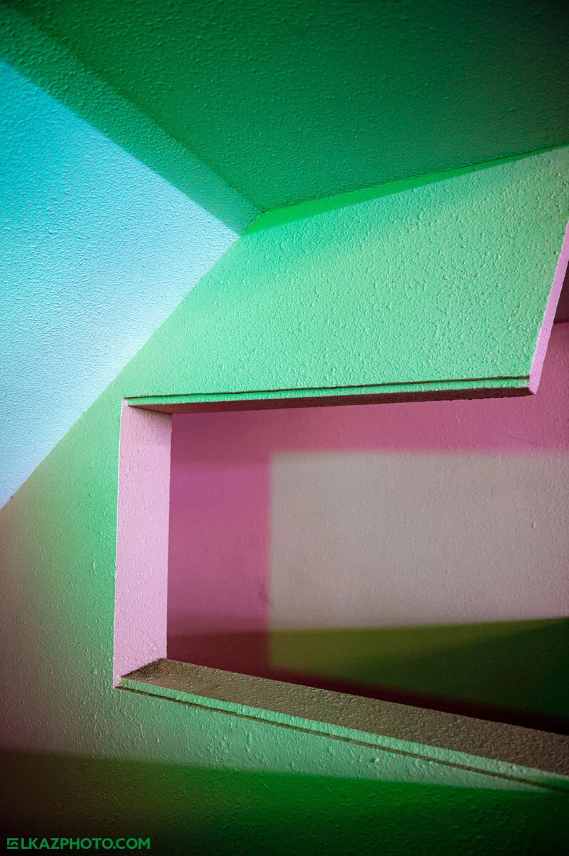
Edited in Adobe Camera Raw.
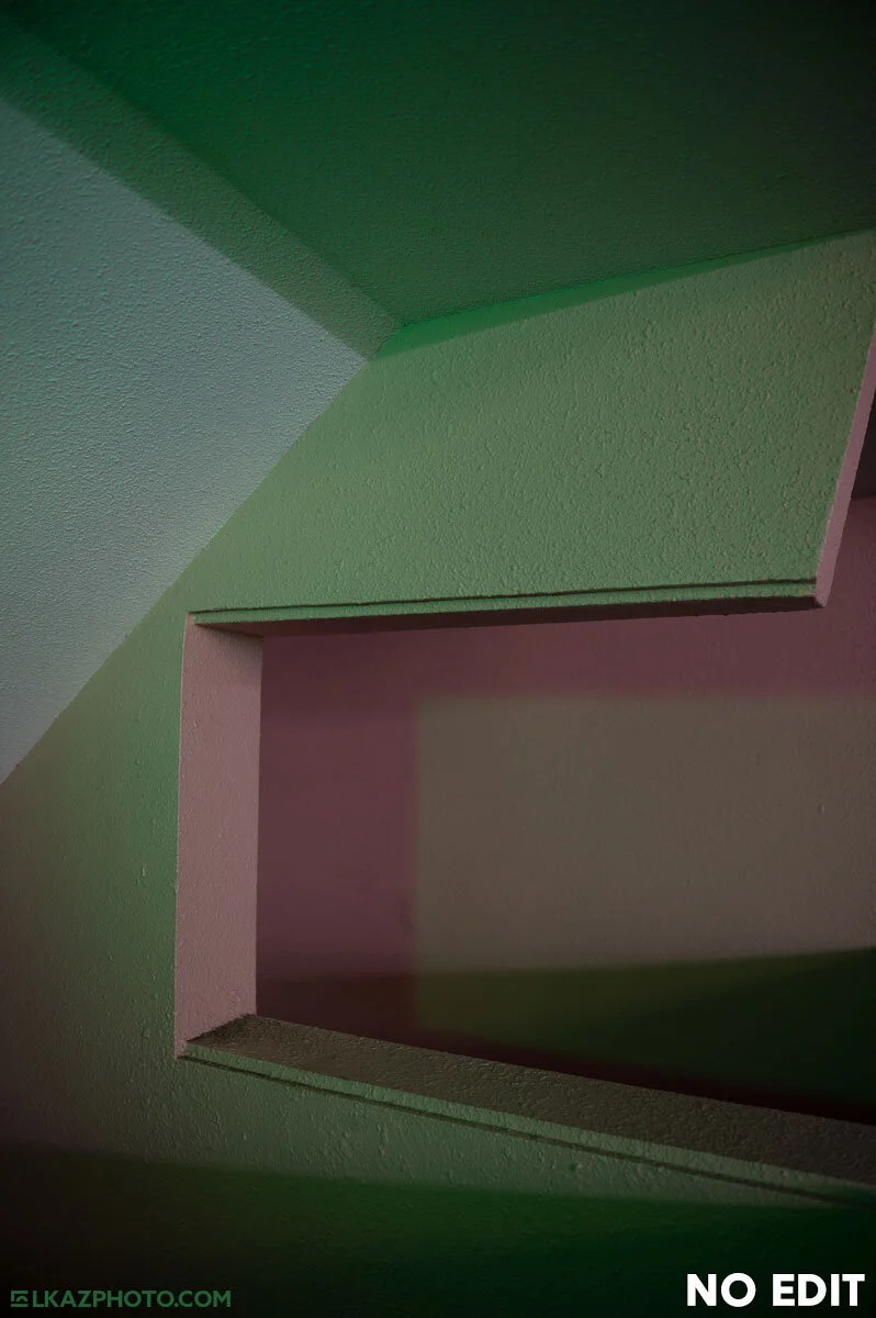
Straight from the camera (Nikon D4) and quite underexposed.
Be True to the Medium
Now, after over a decade of shooting digitally and in color, and spending thousands of hours editing raw images, I know that my initial feelings were rather naïve. The truth is that in a raw digital photograph, there really are no colors per se. They have to be interpreted in some way—a way that ultimately is a bit arbitrary. Whether you select this way or that is entirely up to you. There is no way to ‘see’ a true raw photo, because in order to see it you have to apply some kind of interpretation. Ultimately, to be “true to the medium,” or in other words, to honestly portray my ideas through digital photography, I really had no limits, because the raw data can be molded and morphed into nearly any form I desire. What this left me with is a lot of decisions to make. Once again, I was at the mercy of indecisiveness, this time to an even greater degree.
This necessitated creating constraints for myself, that although arbitrary in some sense, give me consistency within my work and eventually lead to greater creative discovery. Basically, I made rules for myself, which I do occasionally break when the time calls for it. The fundamental rule is a simple one: evoke the colors that exist in the scene and maximize color contrast. So, when I edit, I try to avoid going overboard on changing the colors. I go for the most ‘natural’ look I can, trusting my own memory and perception of the actual scene that I witnessed. Of course, my memory is not infallible, but it is an honest subjective interpretation of the scene. To me, this how I stay ‘true to the medium’ even if in reality there is objective truth in a photograph.
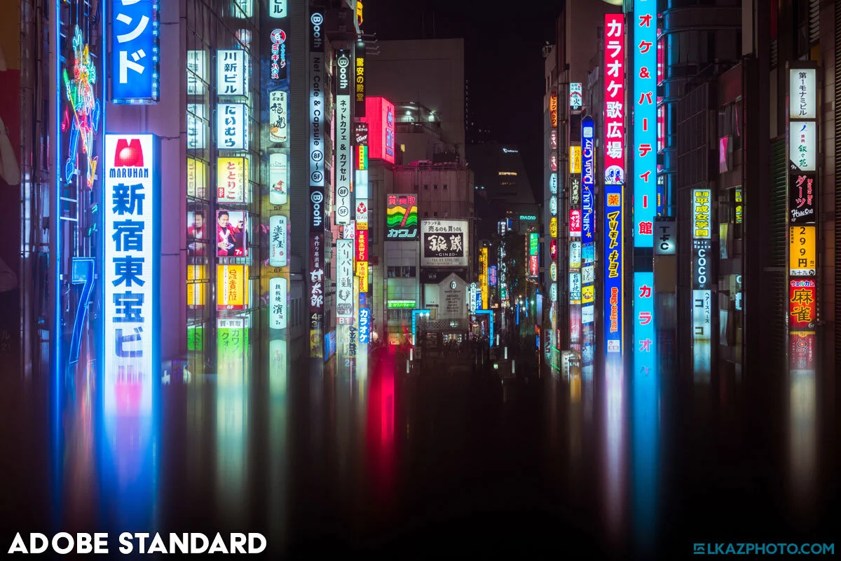
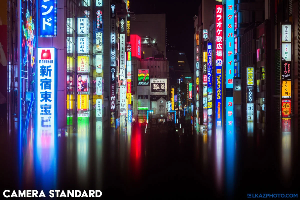
The reds are strangely desaturated.
Perfect saturation in the reds and blues.
Technical Matters about Editing in Color
As I already mentioned, a raw file has to be interpreted. First things first, there is one important option that I feel is often overlooked: the color profile*. Right at the top, just under the histogram, is a section called ‘Profile’ and the default is usually ‘Adobe Standard’ or ‘Adobe Color.’ This is the foundational interpretation of the raw data, and it’s an important decision to make as it has a huge impact on the look and color of the image.
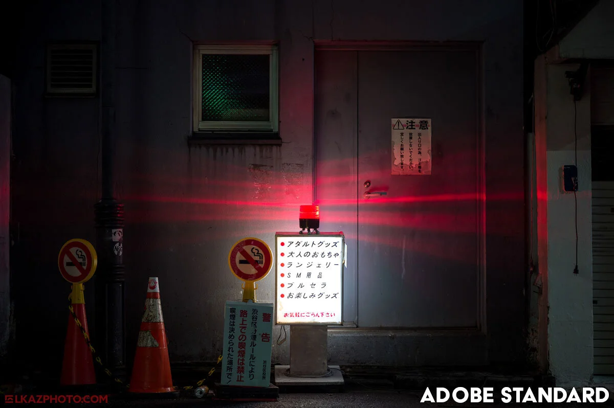
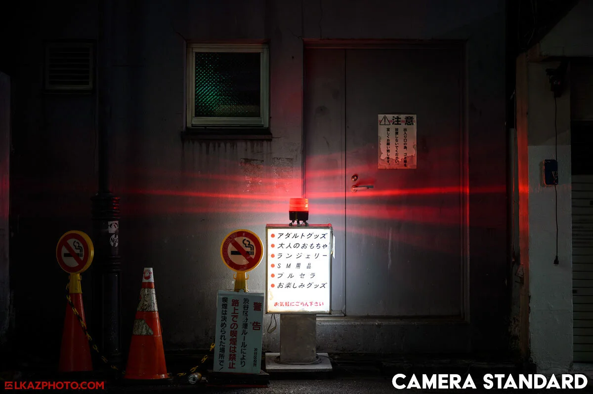
For some cameras, the default Adobe profile looks great, but in the case of my Nikon D4, it sometimes looks great, but sometimes doesn’t. Specifically, the Adobe Standard profile is a bit more saturated/vibrant, giving more chromatic pop to the image from the get-go, but it can distort colors that are already quite saturated, particularly blues and reds.
The only other profile that I like to use is called ‘Camera Standard’ and it is only available for Nikon cameras as far as I can tell. However, I’m sure there are Canon, Sony, Fuji, etc. equivalents that might have slightly different names. This gives me the most accurate colors, without any strange distortions or areas of over-saturation, but at the expense of some immediate visual pop. I always check the look of both Adobe Standard and Camera Standard before proceeding with my editing. And I will usually switch between them throughout my edit as well as at the end to see the difference during the entire process. I keep an eye out for differences in contrast and in the most colorful and saturated parts of the image. I explain all of this in more detail in my video: 7 Tips for Editing Color Photos.
* I use Adobe Camera Raw, so I will reference that software, but Lightroom has the same options.
This time the reds are way too saturated…
…and much more accurate in the camera matched profile.
A Note about Color Spaces and Screens
I am obsessive with doing things ‘correctly’ but as I explained above, there is no such thing as ‘correct’ when it comes to raw digital photography. Sure, in the case of more commercial photography it’s important to get the white balance right, or color match products, but I’m talking about fine art and street photography. Ultimately, in a creative medium like photography there are an infinite number of ‘right’ ways to go and no definitive ‘wrong’ way. It’s all a matter of taste.
That being said, there is something to ‘accuracy’ when it comes to displaying colors. And to that end I do use a pretty high-end monitor that allows me to see the full sRGB color space and nearly the entire AdobeRGB color space. What is a color space? In short, it is how your computer and monitor interpret the color data that is being displayed to you. This is different from a color profile which I described above. The profile interprets the specific raw data in the photo, while the color space determines how these colors are displayed on your monitor.
Wow, this is confusing! I don’t claim to be an expert on this, so here is the main takeaway: if all you’re doing is publishing your photos to the web, then always edit in sRGB! If your Lightroom or Adobe Camera Raw is set to AdobeRGB then your output files might look a bit different than they did while you were actually editing them. In terms of monitor, I do recommend using one that is as close as possible to 100% sRGB, as this will allow you to actually see all of the colors present in your photo. Just don’t break the bank! And of course, not everyone needs this level of accuracy, but I do enjoy working in this way, and I do feel it helps me get the most out of my photos in terms of color.
Pushed the colors quite extremely in this one…
…but the colors are all there, just very flat in the raw file.
How I Edit: White Balance and Color Contrast
Okay, so with my philosophical approach and my technical approach out of the way, how do I actually edit my photos? I don't like to ‘create’ colors that aren’t there (like so many people on social media do these days). I only like to work with what’s in the image itself. This means I don’t like to use techniques that add colors artificially, which, as I’ve explained multiple times now, makes no sense, since there are not ‘true’ indisputable colors in a raw file. So, what do I mean? As I explained, digital editing gives us the freedom to do what we want, which is a blessing and a curse. So, I choose not to employ heavy-handed techniques like split toning or going to heavy on the white balance and giving my photos a strong color cast.
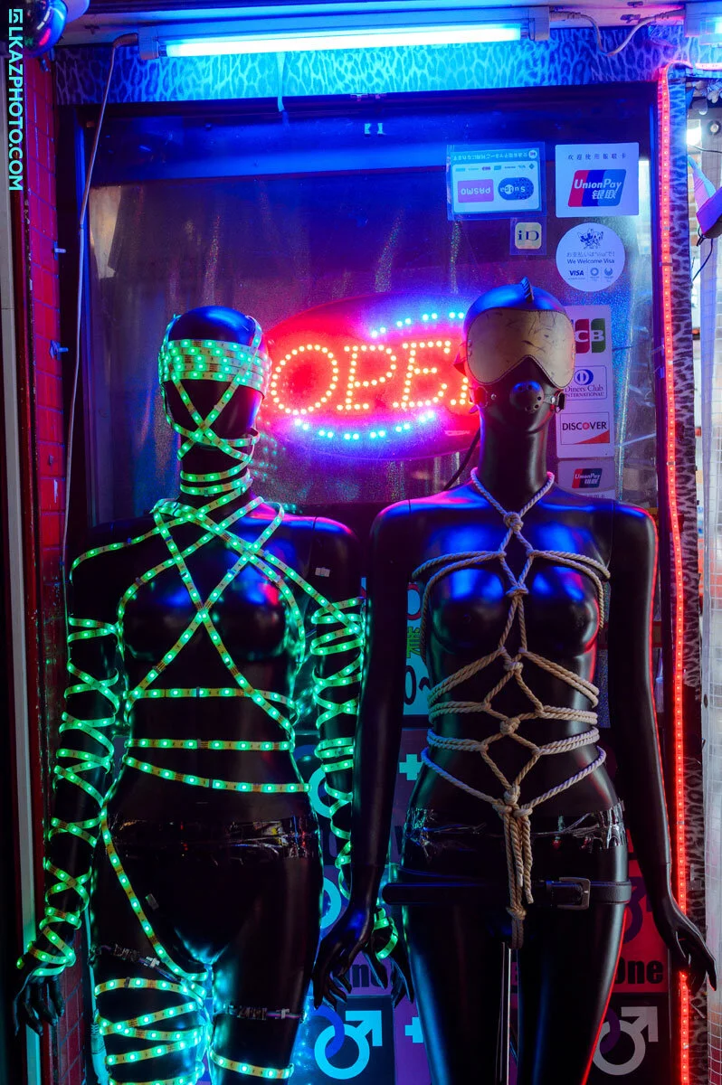
Having said that, I do adjust the white balance all the time! It’s crucial for getting great colors. However, my goal with white balance, as with all my editing steps, is to go for color contrast in the photo. I want all of the colors that are supposed to be present in the scene to pop. The reds should be distinct from the blues, and the greens, and so on. Some of my images do have strong colors casts, but in these cases I find colors out there in the city. I don’t try to add them in.
I love the colorful taxis all over Tokyo.
So, I do use the split toning section in Adobe Camera Raw (or Lightroom) but I use it subtly to make highlights cooler (rarely warmer) and shadows warmer (occasionally cooler) in order to further accentuate the color contrast that I get from only adjusting white balance. Finally, I also use the camera calibration tab to further enhance the shadows with a bit more magenta, which tends to increase color contrast even more. Finally, on some images, I might use the Color Mixer (Hue, Saturation, Lightness) section to subdue or enhance certain specific hues if I feel there is a problematic mix of colors in the photo.
Finally, I break all of these rules when working on projects where I want to create a specific signature look, such as the nearly monochromatic Skylight, or the whimsically saturated and vibrant Vaporized Memories, where I use white balance to create a whole rainbow of colors.
In short, to me, editing is for finding the colors there were actually there and bringing them to their best. For the most part, editing is for polishing a great photo, not for building an image from scratch. It’s true that sometimes you can ‘save’ a mediocre photo in the edit (especially in terms of exposure and dynamic range) but I find it rare that I can make a bad photo any good. It may be a cliché but editing is for making good photos into great photos!
I don’t use presets, but I do use similar techniques and ‘patterns’ for my edits.
Everyone of my photos is edited from scratch. It’s not efficient, but cultivates my creativity.
Don’t Use Presets — Create Your Own Colors
Finally, a word about presets. I don’t use them, and I never have! (This is mainly why I don’t sell presets.) If you use them, that’s okay. I don’t want to make anyone feel bad about how they pursue their creativity. But for me, presets were always counter-productive. I wanted to find my own unique voice and perspective through photography. Editing is major part of that process. To that end, I don’t want to use the color settings that someone else came up with. I want to find my own way, forge my own colors, and share my own unique vision. And I recommend you do the same!


